https://uxplanet.org/ux-101-for-virtual-and-mixed-reality-part-1-physicality-3fed072f371
https://medium.com/@nuralchoudhury/fui-yes-fui-7802862b1e01#.7dbdfarky
FUI! Yes FUI!
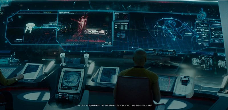
Fictional User Interfaces, Film User Interfaces, Future User Interfaces. That is what we used to call them. Now we call them 3D User Interfaces. Why, because the future is here!
Over the past two years, Virtual and Augmented Reality has changed the face of User Interface design as we know it. The UI we see in Video Games, Film and TV shows are finally possible.
Design as a profession has changed monumentally over the past 20 years too and remains tethered to the industrialisation of our craft, the role of a designer has been forced to evolve by a combination of defining moments in our industry. The dot-com bubble, the decline of print and the explosion of social media. Then again with the huge push for online video and the challenge to disguise advertising as native content.
Whether we see this as a gift or a curse, the next stage of our evolution is 360° Video and Virtual, Mixed and Augmented Reality experiences.
So how do we design for it?
In July 2015, I reached a turning point. What I had been doing for the past 15 years no longer excited me. I wanted to expand my skill set, and VR seemed a natural evolution as I felt nobody was approaching this medium correctly. So I decided to set up my consultancy (akanoodles) to fill the gap in the market created by VR’s resurgence.
Switching to VR and starting a new company have both been challenging. At times, like running into a brick wall, but I persevered. Being so difficult, I thought it best to document some of the topics needed, if you too are thinking about jumping into this exciting new medium (without making the mistakes I did).
Phase 1: Collect Underpants
The present
The first thing we need to know about designing 3DUI’s, are the interfaces found in films, games and television are not actual computer programs. They are animations played back at the correct time. Pretty obvious right.
These depictions have inspired most of the interfaces and products we see today. One of Google’s primary business goals has always been to create the Star Trek computer. So keep dreaming.
The job of a designer is to make things clear, simple and usable. Bad design is only noticeable if it does not work or makes a task more difficult to complete. Our plans should be based on explicit understanding of our users, their tasks and the environment in which they operate. Driven and refined by user-centred evaluation and they must address the whole user experience.
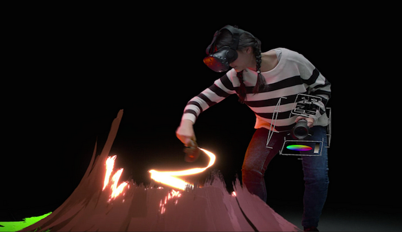
For example, using Adobe Photoshop with Minority Report gloves would only allow you to work for 20 minutes at a time before you got tired or lazy. I am sure occupational health would have some issues with that workstation. However, if your target market requires it, go for it, just look atTilt Brush.
Tools
I am not going to lie; this does get expensive after a while. However, in the end, it is time, motivation and willpower that will be the biggest obstacles, not money.
You do not need an Oculus Rift DK2 or a black-market Hololens. All you need is a sketch pad, some pencils and a computer. All the software is free.Unity3D, Visual Studio, Blender and Android Studio. All of them totally free.
If you want to create/design iOS experiences, you need to publish them on a Mac. If you want to create Hololens experiences, you need to use a PC. I ran my Hololens experiments using the Emulator and ran Windows 10 inParallels.
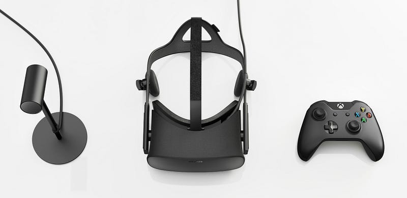
If you want to create designs for Oculus Rift DK2, you cannot do this on the current MacBook Pro. It is too weak and doesn’t have an AMD chip in it to support the Rift. However, don’t sweat it to start.
Experience
VR being such a new space, there aren’t a lot of proven or established design concepts to reference. We have to pull influences from parallel industries to help tackle various design problems.
A variety of skills are required specifically:
- Motion design experience
- Digital product workflow (when working in teams)
- Rapid prototyping and any previous coding skills
- Photography knowledge
- 3D tool experience*
- Making friends also help as nobody is a definitive expert in this field. So make friends, share experiences and keep learning.
*Blender is a good start, then pick an application like Maya, Cinema 4D or3DS Max, which does have a cost. You do not need to be a black-belt in everything, select your tool dependant on the role you want to play in the VR world.
Having a device to test stuff out on, does make your designs better. It gives you empathy and comprehension of how users will interact with your product. You can use your current smartphone and a Google Cardboardviewer. I recommend getting at MergeVR; it looks cool, and you cannot break it. It also allows you to change the focus of the lenses so you do not need to wear glasses if you already do. Email me here and I can sell you a Cardboard Viewer (See, making friends).
Phase 2: ?
VR is unique and a direct path into your senses, your emotions and even your body. In this section, we talk about the theory and the limitations of your senses. All the things that can/will influence the design of your User Interface and product
The Human eye
As you already know, the human eye interprets light. Rod and cone cells in the retina allow conscious light perception and vision, including colour differentiation and the perception of depth.
The retina’s photoreceptors change light signals into electrical ones to allow the brain to build up the shape of an object. Information about the features on the surface of an object, like colour and shading, provide further clues about its identity. The human eye is remarkable but like anything has its shortcomings.
Depth Cues
Now this blew my mind, as I never really thought about it before. Depth cues are the tools our eyes use to determine the identity of objects.
These triggers break into three categories:
Extra-retinal cues (Information not from the retina)
- Convergence — of the eyes varies as you fixate on near and far objects.
- Accommodation — The amount that the eye (lens) accommodates to focus on an object varies with depth.
- Convergence — of the eyes varies as you fixate on near and far objects.
- Accommodation — The amount that the eye (lens) accommodates to focus on an object varies with depth.
Monocular (One eye)
- Linear perspective — Parallel lines facing the observer converge as they move away, toward the horizon.
- Size gradient — The size of an image depends on the scale of the object (of course) as well as its distance from the viewer.
- Height in visual field — Since our eyes are off the ground, objects at different distances project different heights on the retina.
- Shading and contours — Our visual system usually assumes lighting comes from above. The shape of a surface (convex or concave) — and hence the pattern of depth along its surface is affected by shading.
- Occlusion — Yes, objects that appear to block the view of other objects are perceived as closer in depth.
- Atmospheric blur — When viewing a natural scene, the further things are, the more ‘hazy’ they look.
- Motion parallax — As you move your eyes side to side, closer objects move more in the visual field than further objects.
Binocular cues (Two eyes)
- Disparity — Objects at a different lateral location, then stereoscopic presentation. These arrays will give the sub-region the appearance of depth. The lateral difference in position defines its positive or negative retinal disparity and determines whether it appears to be nearer or farther away.
There are probably more, but it is great to know all the above and get your head around how your eyes (can) translate objects. We will refer to them quite often.
Field of View
Field of View (FOV) is the extent of the visible area as seen at any given time.
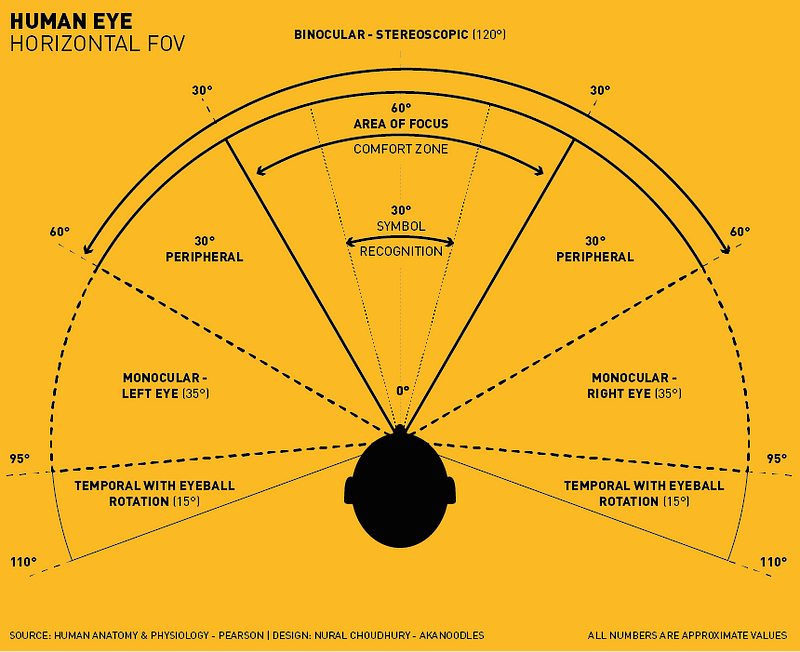
Horizontally, the approximate FOV of an individual human eye is 95° away from the nose and 60° toward the nose. Allowing humans to have an almost 180° forward-facing horizontal field of view.
With full eyeball rotation of about 90° (head rotation excluded, peripheral vision included), the horizontal field of view is as high as 170° for a single eye. Giving us an entire field of view of 220°, without head movement.
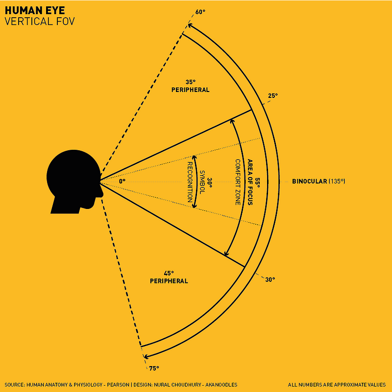
Vertically, the approximate FOV of an individual human eye is 60° upward and 75° downward. Allowing humans to have an almost 135° forward-facing vertical field of view.
Depth of Focus
Not to be confused with depth of field, refers to the distance over which an object moves while remaining in acceptably sharp focus. Both depths of field and depth of focus increase with smaller apertures. The precise Depth of Focus depends on many parameters; axial length, pupil diameter, visual acuity, the chromatic and spherical aberration.
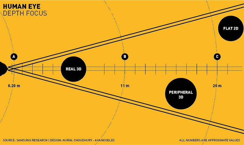
On average, anything moving/viewed closer than 0.20 m (Point A) from your head is difficult to focus on and creates an uncomfortable binocular vision (cross-eyes). The Interpupillary distance (IPD) between your two eyes causes this imbalance as the centre point of the viewable object is different for each eye. The differential distance reduces the further away the object is.
So anything between 0.20 m (Point A) and 11 m (Point B) is of comfortable distance and can be seen in “Real 3D”. Real 3D is a perfect stereoscopic presentation that offers great Binocular disparity to recognise if what we are viewing is 3D or not.
Anything between 11 m (Point B) and 20 m (Point C) is observed with peripheral 3D, meaning there is still Binocular disparity and enough to give the feeling of (motion) parallax if required to solidify the immersive experience.
Beyond 20 m (Point C) is viewed as “Flat 2D” as there is not enough Binocular disparity to distinguish what we are seeing is 3D or not. Our eyes use other depth cues to determine the object’s form. Such as, but not limited to Shading, Contours and Occlusion.
Moreover, incase you were wondering, 20/20 vision has a distance of about 3.1 miles (5 km or 5000 m) on land before the curvature of the Earth makes items disappear along the horizon. In the air, we are looking at about 30 miles (48 km or 48000 m). This is also relative to the intensity of light emitted from what you are viewing.
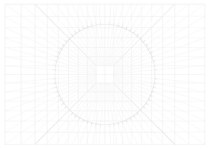
Now using the information we know about our human perceptual system, we can create a 2D grid of your 3D world for us to work on, a Stationary Perspective Grid.
Stationary Perspective Grids
Designers like grids. I love grids, and I am very logical about the way I think about things. I need a grid. With a Stationary perspective grid, you can think in three dimensions even though you are sketching in 2D.
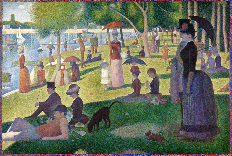
In 2D drawing, all the cues (parallax, convergence and accommodation) disappear. So you must rely on other distance cues (scale, contrast, texture and colour) to denote hierarchy and to create the illusion of 3D space.
The grid I created, has a perspective point of 20 centimetres and a scale of 1:100. Each line drawn at 5° increments.
Working with a Perspective Grid uses a schema similar to the terms used for photography and cinematography.
- Foreground
- Middle ground (Area of Focus)
- Background
- Horizon line
- Ground line
- Middle ground (Area of Focus)
- Background
- Horizon line
- Ground line
Again, we use the scale, contrast, texture and colour to denote hierarchy. Various optical illusions come into play too when working in a three axis environment (X, Y, Z). So take your time and have consideration when designing. A large item in the background will look the same size as a small object in the foreground for example.
Interactions
Now depending on what type of experience you are designing for, your interaction methods will differ. In short let the architecture of your environment, influence the design of the experience.
Smartphones use a combination of accelerometers, gyroscopes, and a compass to track orientation quite accurately. More advanced (smartphone) applications additionally use GPS information to help users identify elements (such as stars and planets) to track the movement, gaze and location of the camera to aid the construction of the environment.
Traditional mouse/keyboard based interactions are impractical for these experiences. In our 3D Virtual world our core methods are:
- Gaze/Raycasting/Cross-hair targeting — What you are looking at via your device’s head tracking and targeting system.
- Gesture/Click — Actions made via controllers, external motion detectors, prolonged gaze or device input buttons
- Voice — Internal/External microphone arrays
- Gesture/Click — Actions made via controllers, external motion detectors, prolonged gaze or device input buttons
- Voice — Internal/External microphone arrays
Other techniques via technologies such as OptiTrack can be employed but let’s keep it simple for now.
Simulator sickness
The last piece of background relates to the factors that will cause your body to feel uncomfortable with VR, simulator sickness.
Oculus Best Practices describes; “Different to motion sickness, simulator sickness occurs when the visual information from a simulated environment, signals self-motion in the absence of actual movement”.
In either case, there are conflicts among the visual, vestibular (balance), and proprioceptive (bodily position) senses that give rise to discomfort.
Simulator sickness includes symptoms unique to virtual environments, such as eye strain/fatigue and differ from individual to individual. The full list of factors can be viewed here (page 23). The technology is rapidly improving to reduce the imbalance, but our design must be respectful to the user during this period.
Numerous factors can reduce simulator sickness:
- Acceleration — Minimise the size and frequency of accelerations
- Degree of control — don’t take control away from the user
- Duration of simulator use — allow and encourage users to take breaks
- Altitude — avoid filling the field of view with the ground
- Binocular disparity — some find viewing stereoscopic images uncomfortable
- Field-of-View — reducing the amount of visual field covered by the virtual environment may also reduce comfort
- Latency — minimise lags/dropped frames are uncomfortable in VR
- Flicker — do not display flashing images or subtle repeating textures
- Experience — experience with VR makes you resistant to simulator sickness (which makes developers inappropriate test subjects)
Phase 3: Profit
So now you know the limitations of your body, we can align these with the limitations of our devices. I worked with a Gear VR, so will pull out the restricting factors of this device alone.
Samsung Gear VR
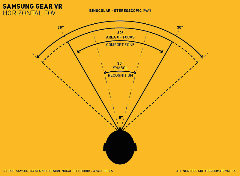
Gear VR has a Field of View of 96° and like your natural eyes, you do not see ‘everything’ in focus 100% of the time. Your main focal area is 30° to the left and 30° to the right. No muscle strain or discomfort. That is one comfort zone and your central focal area.
You still ‘see’ everything in 96° FOV but outside this focal area is counted as peripheral. Samsung also tested the maximum you can/could/would turn your head, and that is 55° with comfort. This movement requires some effort, and any repetitive movement like this is not a great experience.
Samsung also suggests that 20° up, 12° down as smooth vertical movements. Again, the maximum you can/could/would tilt your head is 60° up and 40°down, with effort.
Architectural Foundations
One of the early points I made was, the architecture of our environment should influence the experience of our design.
We have learnt that elements that do not require constant attention could/can exist in peripheral areas. We have also discovered that your main focal area should contain your primary elements like video, models, galleries or unobstructed views.
How we display the 3D User Interfaces can serve and determine the experience. Whether the application is for Community Building, Information Management, Fun, Information Seeking, Learning, Assistance, Shopping or Story Telling.
We can use UI to frame our content and delimit the experience, as in a head-up display for a fun cockpit experience. UI can be a subject of the work itself, for example in Task-based Learning applications, such as reading, browsing or drawing. From experience, we know interfaces that are contextual to the environment are more accepted and intuitive in VR.
2D UI elements in 3D
There are certain elements we are familiar with in 2D form that will work in three dimensions:
The Accordion
If used for navigation an accordion is the conceptual equivalent to using Tabs or an alternative to a Navigation Tree.
If used for navigation an accordion is the conceptual equivalent to using Tabs or an alternative to a Navigation Tree.
From a usability point of view, accordions are a bad idea and are worse than conventional implementations. Albeit, they can be put to good use to manage settings with only a few pages to navigate through.
Fly-out Menu
Fly-out Menus are great with vertically displayed information. The vertical order and visual design are necessary to communicate the differences in importance. Fly-out menus save space and declutter valuable screen space.
Fly-out Menus are great with vertically displayed information. The vertical order and visual design are necessary to communicate the differences in importance. Fly-out menus save space and declutter valuable screen space.
Breadcrumbs
Used as an indication of where users are and how information is structured. Usability tests have shown Breadcrumbs never cause alarm and people use them. Used in 3D can guide users through a room or display the progress of a form or stages of an experience or narrative.
Used as an indication of where users are and how information is structured. Usability tests have shown Breadcrumbs never cause alarm and people use them. Used in 3D can guide users through a room or display the progress of a form or stages of an experience or narrative.
Home Link
Home links provide a safe exit point. No matter what, users need always to get back to a familiar place. In VR a common theme has been to put them in a peripheral position to avoid clutter.
Home links provide a safe exit point. No matter what, users need always to get back to a familiar place. In VR a common theme has been to put them in a peripheral position to avoid clutter.
Icon Menu
Icon Menus limit screen-space and can create very dynamic menus. Universally understood Iconography communicate across different audiences, remove language barriers and minimise clutter.
Icon Menus limit screen-space and can create very dynamic menus. Universally understood Iconography communicate across different audiences, remove language barriers and minimise clutter.
Spatial wayfinding (and Maps)
We are comfortable with real world maps, and we are comfortable with seeing them on the digital platforms. Spatial wayfinding in VR is similar to reality; we use visual cues in our environment to indicate where we are, using street names or landmarks.
We are comfortable with real world maps, and we are comfortable with seeing them on the digital platforms. Spatial wayfinding in VR is similar to reality; we use visual cues in our environment to indicate where we are, using street names or landmarks.
In open world environments where the user is required to navigate to a marker on a map for an actionable task. Positional cues help users orient themselves such as directional compass indicators and arrows.
From a usability point of view, access to a larger 2D map is encouraged. Aligned with points of interest (POI) gives users a sense of security and avert any feelings of being lost.
Minesweeping (and Hover states)
Minesweeping involves the user moving over or interacting with an object. While Minesweeping does hide information, it can be an effective way to declutter your environment.
Minesweeping involves the user moving over or interacting with an object. While Minesweeping does hide information, it can be an effective way to declutter your environment.
From a usability point of view, attraction and stimulation techniques are required. Whether with light, scale or sound.
Scrolling Menus (and Carousels)
With limited Field of View, it is not always possible to present several objects at once. A scrolling menu minimises a user’s action; it may also complicate it for some, but this form of UI is an efficient way to prioritise attention as well as a hint of additional content.
With limited Field of View, it is not always possible to present several objects at once. A scrolling menu minimises a user’s action; it may also complicate it for some, but this form of UI is an efficient way to prioritise attention as well as a hint of additional content.
Order of Importance
Now if you are coming from a Digital 2D background, you need to think about your order of importance slightly differently.
Traditionally digital experiences are designed to a similar logic like this:
- Why am I here?
- Is the order of information correct?
- Can I see and read things correctly?
- Does the colour palette work?
- What is the call to action?
- Is there enough negative space?
- Are the tone of images supportive of brand positioning?
- Does this suit my target audience?
- Where is the navigation?
- Is there a logical page hierarchy?
- What was the load time?
- I this broken?
All very logical, but slightly different for the Virtual world.
When users think about using VR/AR/MR, they want to go all in and are task driven. Primarily they are looking for immersion. To feel transported and immersed in an environment they may not be able to regularly access.
The questions they ask themselves follow as logic not dissimilar to:
- Where am I?
- What am I seeing?
- What is my focal point?
- Do I need to do anything?
- Can I get there?
- What actions do I have to do to get there?
- What if I stay here?
- Do I want to stay here?
- What do I experience if I stay here?
- What is that sound?
- Where am I?
- What am I seeing?
- What is my focal point?
- Do I need to do anything?
- Can I get there?
- What actions do I have to do to get there?
- What if I stay here?
- Do I want to stay here?
- What do I experience if I stay here?
- What is that sound?
Our brain asks these questions everytime our head rotates, or we adjust the position of our gaze. We are constantly thinking of the next actionable step.
Storytelling
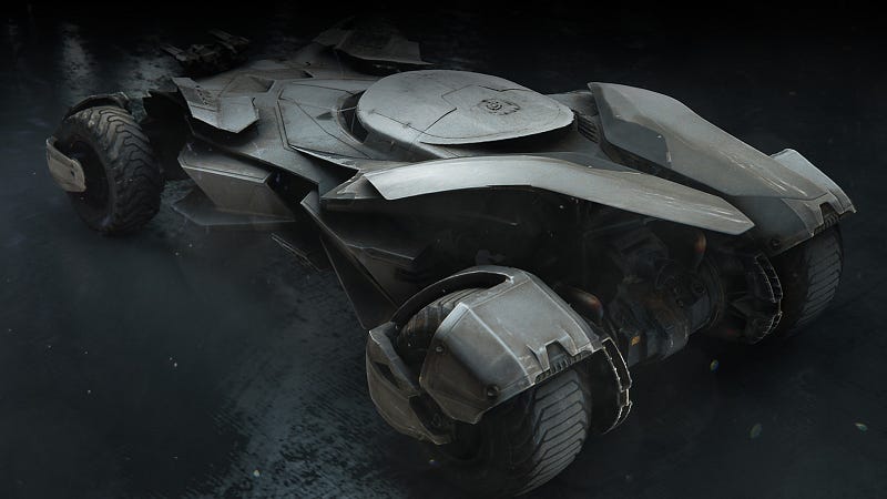
To make our experience meaningful, we must determine the motive of our experience. If the goal, is to simulate the inside of a Batmobile. Then storyboard that experience and see what actions need to be taken to achieve this.
If no interaction is required, it is an on rails (predetermined) experience and what we call 360° Video and Images.
If you want to make an actionable experience, then we need to think about it step by step. Storyboarding, working one plane at a time.
If dealing with degrees, meters and planes become too challenging you may want to jump right into After Effects.
If dealing with degrees, meters and planes become too challenging you may want to jump right into After Effects.
I prefer to storyboard my ideas, documenting a flow of logic, creating key perspective mocks to test my UI placement, then I think about the User Experience holistically and how my thinking matches the environment and user goals.
In conclusion
FUI is relative to its function. Working in this discipline is both an artistic and technical process. Each design starts with concept art, sketches, renderings, and prototypes.
Once completed, we test, iterate and improve on these ideas. Evolving the idea until our environments or scenarios are robust and appealing.
Design goals must have purposes in providing users with a goal and an enjoyable experience. Good design strives to produce quality, provide an immersive experience, and sometimes, provide a fulfilling story-based experience.
I hope my story is of some help to you during this next phase of our industry’s evolution, and you can take advantage of the next big challenge in front of us.
About the author
Nural Choudhury is Founder and Creative Director of akanoodles design consultancy. He is an experienced leader and strategist with a background in user experience, visual design, development and product management.
An expert in Social, Broadcast, Business, HCD and Immersive experience design and has led projects for News International, Disney and Turner to name a few.
akanoodles design consultancy
akanoodles is an independent consultancy working across Social, Broadcast, UX, and Immersive experiences. They combine high-level strategic thinking, with creativity, product development and data insight to meet consumer and business goals, and have helped companies remain competitive by introducing new concepts and ideas.


