2D UI elements in 3D
There are certain elements we are familiar with in 2D form that will work in three dimensions:
The Accordion
If used for navigation an accordion is the conceptual equivalent to using Tabs or an alternative to a Navigation Tree.
From a usability point of view, accordions are a bad idea and are worse than conventional implementations. Albeit, they can be put to good use to manage settings with only a few pages to navigate through.
Fly-out Menu
Fly-out Menus are great with vertically displayed information. The vertical order and visual design are necessary to communicate the differences in importance. Fly-out menus save space and declutter valuable screen space.
Breadcrumbs
Used as an indication of where users are and how information is structured. Usability tests have shown Breadcrumbs never cause alarm and people use them. Used in 3D can guide users through a room or display the progress of a form or stages of an experience or narrative.
Home Link
Home links provide a safe exit point. No matter what, users need always to get back to a familiar place. In VR a common theme has been to put them in a peripheral position to avoid clutter.
Icon Menu
Icon Menus limit screen-space and can create very dynamic menus. Universally understood Iconography communicate across different audiences, remove language barriers and minimise clutter.
Spatial wayfinding (and Maps)
We are comfortable with real world maps, and we are comfortable with seeing them on the digital platforms. Spatial wayfinding in VR is similar to reality; we use visual cues in our environment to indicate where we are, using street names or landmarks.
In open world environments where the user is required to navigate to a marker on a map for an actionable task. Positional cues help users orient themselves such as directional compass indicators and arrows.
From a usability point of view, access to a larger 2D map is encouraged. Aligned with points of interest (POI) gives users a sense of security and avert any feelings of being lost.
Minesweeping (and Hover states)
Minesweeping involves the user moving over or interacting with an object. While Minesweeping does hide information, it can be an effective way to declutter your environment.
From a usability point of view, attraction and stimulation techniques are required. Whether with light, scale or sound.
Scrolling Menus (and Carousels)
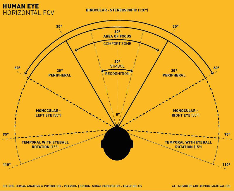
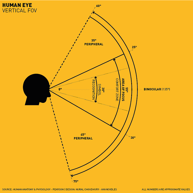
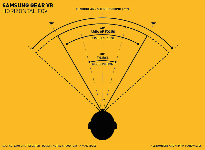
With limited Field of View, it is not always possible to present several objects at once. A scrolling menu minimises a user’s action; it may also complicate it for some, but this form of UI is an efficient way to prioritise attention as well as a hint of additional content.


